Logo design is considered to be one of the most popular and demanded web design sphere that enables companies to boost their own corporate identity. No company can survive and, what’s more, get developed, without having a logo perfectly designed for it, in accordance with all its requirements, corporate culture, and the company’s history. That is why logo design trends should always reflect the company’s identity. Take a look at the following logo trends that will help you to reveal the essence of your brand.
1. Minimalism
If you think that minimalism is about making things smaller or shrink them, you’re mistaking. Real minimalism is about choosing essential things and accomplishing them the way your imagination allows you to. Logos in a minimalistic style are considered to carry the most exquisite essence inside. They are even more stunning if you take into account the fact they take so little space. Take a logo at Natwood, for example. It was designed on the design platform DesignContest (a marketplace created for designers that enables them to compete for the projects by presenting their best ideas to potential clients), which can explain the fact that the company got so many suggestions on how the logo should look like. The most amazing thing is that, even if the client didn’t specify that, almost all the suggested logos were coined in a minimalistic style. Logo designers from all over the world decided (each separately) to create a minimalistic logo, which proves the enormous popularity of this style.
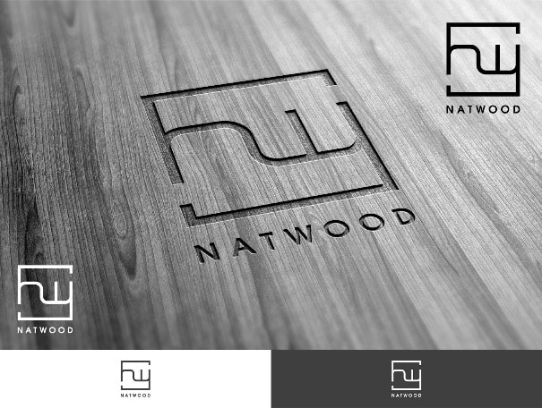
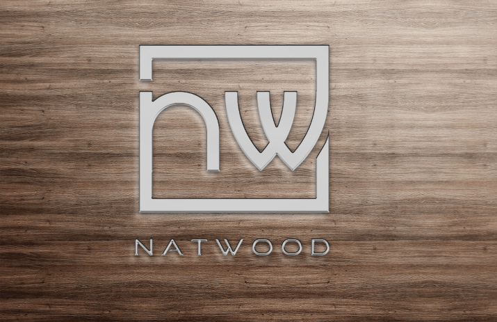

Choosing minimalism for your brand identity means showing clients that your company is well structured and that you have thought of every single detail.
2. Animalism
Depicting animals on your company’s logos is great because this way you give a sparkle your logos of human touch. Most clients want to see this very sparkle on their future creative logos. What’s more, animalistic designs give the company a beautiful story and a character they may use in order to get associated with. It doesn’t really matter what business sphere the company deals with – animals depicted on logos will be appropriate anytime.

In Latin, “anima” means breath, spirit, and life. That is why the logo designs that contain animalistic elements look so sincere and soulful. They are a perfect for those companies that want to get personalized.
3. Vintage
Vintage logos are smooth, sophisticated and created in a wonderful way. When clients want their logo to be vintage, they expect it to be extremely gorgeous and creative. Vintage logos have their own taste, implementation, and expectations that cannot be failed. The general impression that these logos leave behind cannot be mixed with anything else.
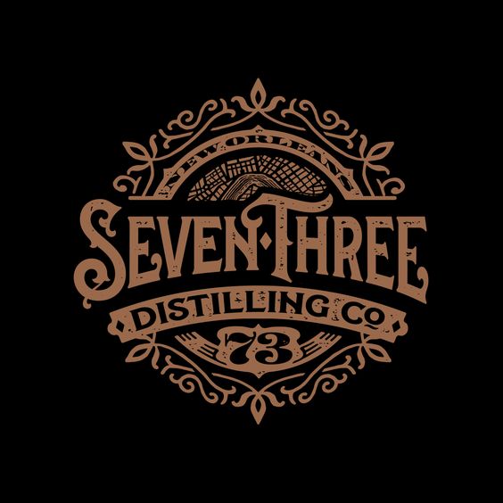
Vintage logo designs add gloss to your brand, making it meaningful and rich. Even if your business has just been started, such logo can give your company years of people’s trust. Therefore, if you want your brand to look stylish and modern, never hesitate in using vintage logos.
4. Shadow breaks
Shadow breaks are a relatively new trend in logo design. New, but efficient. They bring a custom logo closer to life, look stunning on any webpage, and add some volume to the general image. Using (or not using) a shadow on your logo design, you may achieve quite a few surprising effects. As a rule, shadows help designers to change the logo, making it flat or material. Thus, shadow breaks on design are all about changes.
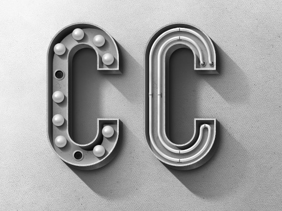
If you want to show people how flexible your brand is, shadow breaks on a logo design will be a perfect option for you.
5. Animation
Logo designs should no longer be static. In the XXI century, the success of your business is hidden in its constant movement. What is more, almost every small business has got its own corporate webpage that illustrates its product or service. That is why animated logo designs could not have come at a better time. They are beneficial in all the ways imaginable. According to the recent researches, animated logos keep users engaged on your websites for a longer time. That is why, your website’s organic grows (even if this increase is not so significant) simply due to your logo design. When printed, you cannot make the logo animated, but you can increase it volume and make it 3D.
Animated logo designs make your brand look lively and vivid. This impression will never fade away, keeping your company in trend.
6. Glistening logo designs
Bright, colorful, glistening, glittering logo designs are a perfect solution for those brands that want to get noticed. Such dazzling designs complement the companies that want to look fresh, alluring and loveable. The only thing left to do is not to oversaturate your design with such colors. As a rule, the biggest mistake of designers is when they go too bold with the logos they design. In this case, they mix everything, from styles to colors and fonts, and come up with a real kitsch. That is why, if you want to show a glistening brand with a matching logo design, don’t forget about moderation. Using too many of everything would be a true mistake.
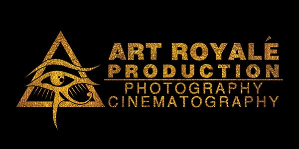
When you make your logo design glitter, your show your clients that you aren’t afraid of taking risks, which always turns out to be a successful venture.
Bottom line
One logo can tell people a lot about the brand it represents. In other words, logos are rather a soul of your brand than simply its face. They create the connection between your clients and the products or services your company deals with. Therefore, try to make this connection secure by showing people your initial aims with the help of your gorgeous logo designs.
Speedy Web Work is a good company which you can hire for best logo design.
Want to publish a guest post on aamconsultants.org?
Place an order for a guest post or link insertion today.

