Why Pictures Are Critical to Responsive Web Design
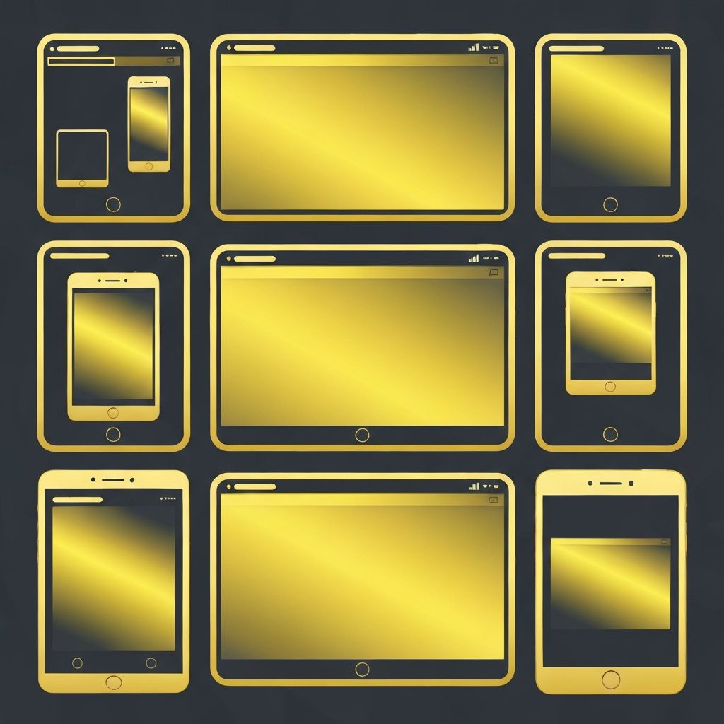
Pictures are one of the most powerful elements of any website. They communicate emotion, convey product details, build trust, and break up text into digestible sections. But on a responsive website, pictures are also one of the biggest performance challenges. Large, unoptimized images slow down load times, frustrate mobile users, and hurt SEO. Done right, however, responsive web design pictures can be both visually stunning and lightning-fast.
The key is to think of images not as static decorations but as adaptive media that adjusts to different devices, network speeds, and contexts. Modern web design demands a smart strategy for choosing, sizing, optimizing, and delivering pictures across every screen.
Hire AAMAX.CO for Visually Stunning Responsive Websites
If you want a website that looks beautiful on every device without sacrificing performance, AAMAX.CO can help. They are a full-service digital agency offering Website Design and Website Development services worldwide. Their team specializes in responsive design with carefully optimized imagery, art direction, and modern image formats that load fast while maintaining visual impact. They understand the balance between aesthetics and performance, ensuring your site looks professional and ranks well in search.
Choose the Right Image Format
Format selection is the first big decision. JPEG remains common for photographs but is being replaced by more efficient formats like WebP and AVIF, which offer significantly smaller file sizes at the same quality. PNG is best for images with transparency or sharp edges like logos. SVG is ideal for icons and illustrations because it scales perfectly at any size with virtually no file size penalty.
Modern responsive design often uses multiple formats together. The HTML <picture> element lets you offer AVIF first, fall back to WebP, and then JPEG for older browsers. This way, every visitor gets the most efficient format their browser supports.
Use Responsive Image Attributes
The srcset and sizes attributes allow browsers to pick the right image based on screen size and resolution. Instead of serving a giant 2000-pixel-wide image to a phone, the browser can choose a smaller version optimized for that device. This dramatically reduces bandwidth usage and load times on mobile.
Combine this with art direction using the <picture> element to serve different crops or compositions for different breakpoints. A wide, cinematic hero image on desktop can become a tighter, vertical shot on mobile—keeping visual impact without awkward cropping.
Optimize, Compress, and Lazy-Load
Even with the right format, images need compression. Tools like Squoosh, ImageOptim, and TinyPNG can reduce file sizes by 40–80% with minimal quality loss. Many CDNs and modern frameworks offer automatic image optimization, resizing and compressing images on the fly based on the requesting device.
Lazy-loading is another essential technique. Instead of loading every image upfront, lazy-loading defers off-screen images until the user scrolls near them. The HTML loading="lazy" attribute makes this trivial to implement. Combined with proper compression, lazy-loading can cut initial page load times in half.
Aspect Ratios and Layout Stability
One of Google's Core Web Vitals, Cumulative Layout Shift (CLS), measures how much content jumps around as a page loads. Images without defined dimensions are a leading cause of layout shift. Always specify width and height attributes (or use CSS aspect-ratio) so the browser can reserve space for the image before it loads.
This not only improves CLS scores but also creates a smoother experience for users. Nothing is more annoying than tapping a button only to have it shift down because an image just loaded above it.
Accessibility and Alt Text
Pictures aren't just for sighted users. Screen readers rely on alt text to describe images to visually impaired visitors. Good alt text is descriptive, concise, and contextual—explaining what the image shows and why it matters. For purely decorative images, use an empty alt attribute (alt="") so screen readers skip them.
Beyond accessibility, alt text helps SEO. Search engines use alt text to understand image content, which can drive traffic from Google Image Search. Combine alt text with descriptive file names and structured data for maximum visibility.
Art Direction for Storytelling
Beyond the technical side, pictures should tell a story. Avoid generic stock photos that everyone else uses. Invest in custom photography, branded illustrations, or carefully curated imagery that reflects your brand personality. Authentic visuals build trust and emotional connection in ways that polished but generic images cannot.
Plan image direction during the design phase, not after. Photographers, illustrators, and designers should work from the same creative brief so everything feels cohesive. Consistency in style, color, and tone across all images strengthens your brand identity.
Final Thoughts
Responsive web design pictures are more than just images on a page—they're a critical component of performance, accessibility, branding, and SEO. By choosing the right formats, using responsive attributes, compressing intelligently, and prioritizing accessibility, you create websites that look stunning on every device while loading fast. Combined with strong art direction, your imagery becomes a powerful tool that elevates your brand and drives meaningful engagement.
Want to publish a guest post on aamconsultants.org?
Place an order for a guest post or link insertion today.