Introduction to Web Card Design
Card design has become one of the most popular patterns in modern web interfaces. A card is a self-contained unit that groups related information, such as an image, title, description, and call to action, into a single visual block. Cards are versatile, scannable, and easily rearranged, which is why they appear everywhere from product listings to dashboards, news feeds, and portfolios. When designed well, cards make content easier to digest and interfaces more flexible across devices.
Hire AAMAX.CO for Modern Web Card Design
If you want to elevate your website with sleek, conversion-focused card layouts, you can hire AAMAX.CO to bring your vision to life. Their website design team specializes in modular, component-based interfaces that look great on every screen size. They craft cards that are visually striking, technically sound, and aligned with your brand identity, helping your content stand out in feeds, galleries, and listings.
Why Cards Work So Well
Cards mimic the way we interact with physical objects, like business cards, recipe cards, or playing cards, making them intuitive at a glance. Each card represents a discrete chunk of content with a clear visual boundary, which helps users scan and prioritize. Cards are also inherently responsive: they can stack vertically on small screens, sit in grids on larger displays, and adapt to varying amounts of content without breaking the layout.
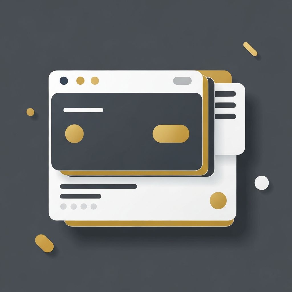
Anatomy of a Great Card
While cards vary in purpose, most include a few common elements: a media area (image, video, or illustration), a title, supporting text, metadata such as dates or categories, and one or more actions like a button or link. Visual hierarchy guides the eye from media to title to body to action, ensuring users absorb information in the intended order. Consistent padding, alignment, and spacing make cards feel polished and trustworthy.
Visual Hierarchy and Typography
Hierarchy within a card is critical. Titles should be the most prominent text, often in a heavier weight or larger size. Supporting copy uses comfortable line heights and limited line lengths to encourage reading. Metadata like timestamps, authors, or tags appears smaller and lighter, providing context without competing for attention. Strong typography ensures cards remain legible whether viewed on a sprawling desktop or a compact mobile screen.
Imagery and Media
Images often play a starring role in card design. High-quality, appropriately cropped visuals draw the eye and set the tone for the content. Aspect ratios should be consistent across cards to keep grids tidy. Lazy loading, responsive images, and modern formats like WebP improve performance, especially in long lists. For cards without natural imagery, illustrated icons, abstract patterns, or subtle gradients can serve as engaging alternatives.
Layout Patterns and Grids
Cards thrive within flexible grid systems. CSS Grid and Flexbox make it easy to arrange cards in responsive layouts that adapt to screen size and content volume. Masonry layouts allow cards of varying heights to nest tightly together, while uniform grids emphasize consistency. Equal-height cards prevent jagged baselines, even when content lengths differ. Thoughtful breakpoints ensure cards remain usable from phones to ultrawide monitors.
Interactive States and Hover Effects
Cards become more engaging with subtle interactivity. Hover states might lift the card with a soft shadow, reveal additional actions, or shift imagery slightly to suggest depth. Click and tap feedback confirms that the user's input has been registered. On touch devices, where hover does not exist, alternative cues like persistent buttons or swipe gestures preserve usability. Animations should feel smooth and purposeful, never distracting.
Cards for Different Use Cases
Different contexts call for different card styles. Product cards highlight pricing, ratings, and add-to-cart buttons. Article cards emphasize titles, excerpts, and reading times. Profile cards spotlight avatars, names, and contact actions. Dashboard cards summarize key metrics with charts or numbers. Tailoring card content and structure to the specific use case ensures users get exactly the information they need without unnecessary noise.
Accessibility in Card Design
Accessible cards work for everyone. Use semantic HTML, such as articles or list items, to communicate structure. Ensure interactive cards are keyboard navigable, with clear focus states. Avoid relying solely on color to convey meaning, and provide descriptive alt text for images. When the entire card is clickable, make sure screen readers announce the destination or action clearly. Inclusive design widens reach and reflects well on the brand.
Performance Considerations
Card-heavy pages can become slow if not optimized. Lazy loading images, virtualizing long lists, and minimizing layout shifts all improve performance. Keeping markup clean and CSS efficient prevents bloat as the number of cards grows. Caching strategies and CDN delivery ensure cards render quickly for users around the world, regardless of network conditions.
Conclusion
Web card design is a deceptively simple pattern that powers many of today's most engaging digital experiences. By focusing on hierarchy, imagery, responsiveness, and accessibility, designers can create cards that delight users and showcase content beautifully. Whether you are building an e-commerce store, a media platform, or a SaaS dashboard, mastering card design unlocks flexibility and visual appeal that scales across every context.
Want to publish a guest post on aamconsultants.org?
Place an order for a guest post or link insertion today.