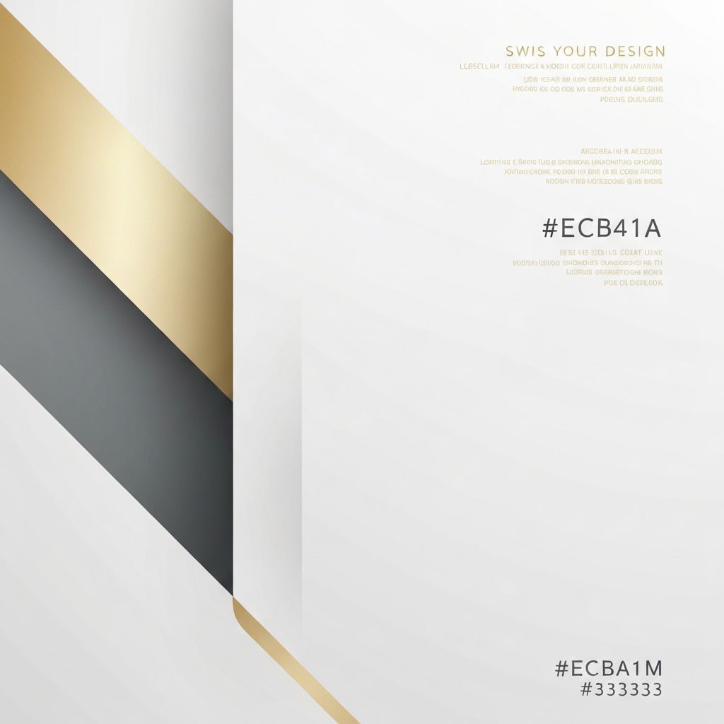
The Enduring Influence of Swiss Web Design
Swiss web design, also known as the International Typographic Style, is rooted in a graphic design movement that emerged in Switzerland during the 1950s. Its emphasis on clarity, objectivity, and rational structure transformed editorial and corporate design across Europe and eventually the world. Decades later, its core principles remain remarkably relevant in the digital realm. Swiss-inspired websites are clean, content-focused, and confident, allowing typography, grid systems, and white space to do the heavy lifting. In a web filled with visual clutter, Swiss design provides a refreshing, timeless approach that ages gracefully and communicates with calm authority.
How AAMAX.CO Applies Swiss Principles to Modern Websites
Bringing Swiss design principles into a contemporary digital project requires both restraint and craftsmanship. AAMAX.CO blends timeless typography, precise grid systems, and modern interactivity in their website design projects, helping clients communicate clearly without sacrificing personality. Their designers understand how to translate the rigor of Swiss style into responsive, performance-focused experiences that feel premium, professional, and unmistakably modern.
Core Principles of Swiss Design
Swiss design is defined by a few enduring principles: a strong grid, sans-serif typography, generous white space, asymmetric layouts, objective photography, and minimal ornamentation. The emphasis is on communication rather than decoration. Every element earns its place, and nothing is included merely to fill space. This discipline produces designs that feel calm, confident, and purposeful.
The Power of the Grid
The grid is the backbone of Swiss web design. It provides a consistent framework that organizes content, aligns elements, and creates rhythm across pages. On the web, modular grids translate beautifully into responsive layouts, where columns adapt fluidly to different screen sizes. A well-constructed grid makes the user's eye flow naturally through the page, improving comprehension and engagement.
Typography as the Hero
Typography is central to Swiss design. Classic sans-serif faces such as Helvetica, Univers, and Akzidenz-Grotesk dominate, although contemporary designers also explore modern alternatives like Inter and Söhne. Hierarchy is established through size, weight, and spacing rather than color or decoration. On the web, careful attention to line height, letter spacing, and responsive scaling ensures that typography remains legible and elegant across devices.
White Space as a Design Element
White space, or negative space, is treated as an active component rather than empty filler. It gives content room to breathe, focuses attention on what matters, and conveys confidence. Swiss-inspired websites often use generous margins and padding to create a sense of luxury and clarity, making even simple content feel important and intentional.
Objective Imagery and Iconography
Swiss design favors objective, documentary-style photography over staged or overly stylized imagery. When illustrations or icons are used, they tend to be geometric, precise, and minimal. This visual restraint complements the typography and grid, ensuring that imagery supports the message rather than competing with it for attention.
Color in Swiss Web Design
Color palettes in Swiss design are typically restrained, often built around black, white, and gray with one or two strong accent colors. This restraint creates striking contrast and reinforces hierarchy. On modern websites, designers extend this approach with carefully chosen brand colors that feel deliberate rather than decorative, maintaining the calm, confident aesthetic of the original movement.
Swiss Design Meets Modern Interactivity
While the original Swiss style was primarily print-based, its principles adapt elegantly to interactive media. Subtle animations, micro-interactions, and responsive layouts can enhance Swiss-inspired websites without breaking their disciplined feel. The key is restraint: motion should support comprehension and feedback, not draw attention to itself or distract from the content.
Why Swiss Design Still Resonates
In an era of constant visual noise, Swiss web design offers a sense of order and trust. Its emphasis on clarity makes it ideal for editorial sites, corporate brands, cultural institutions, and any organization that values substance over spectacle. Users appreciate the calm, easy-to-read experience, and search engines reward the clean structure and accessible typography.
Conclusion: Less, but Better
Swiss web design embodies the philosophy of less but better. By prioritizing clarity, structure, and meaningful content, it produces digital experiences that feel timeless and trustworthy. For brands seeking a sophisticated, enduring online presence, Swiss-inspired design remains one of the most powerful aesthetic choices available today.
Want to publish a guest post on aamconsultants.org?
Place an order for a guest post or link insertion today.